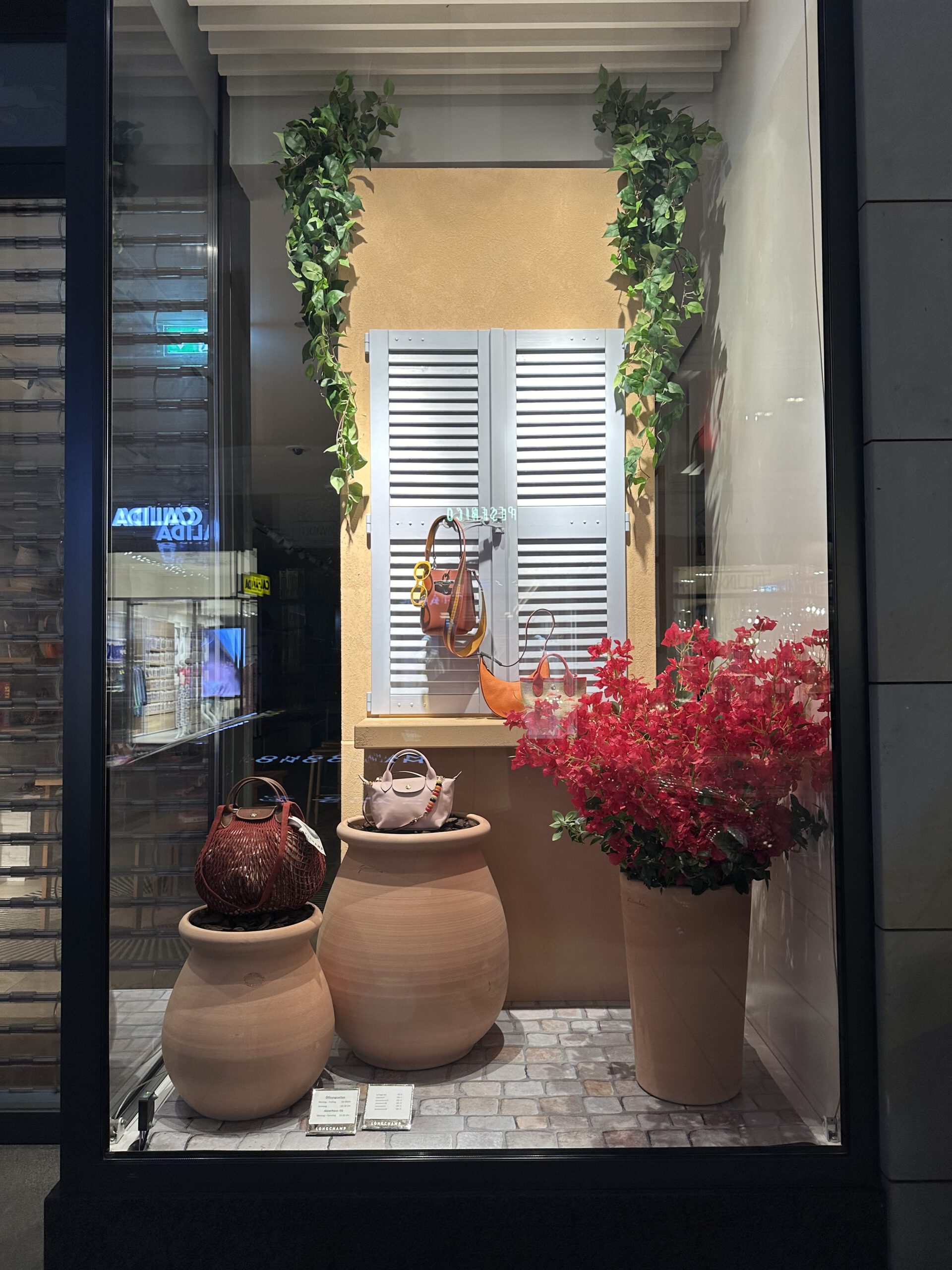
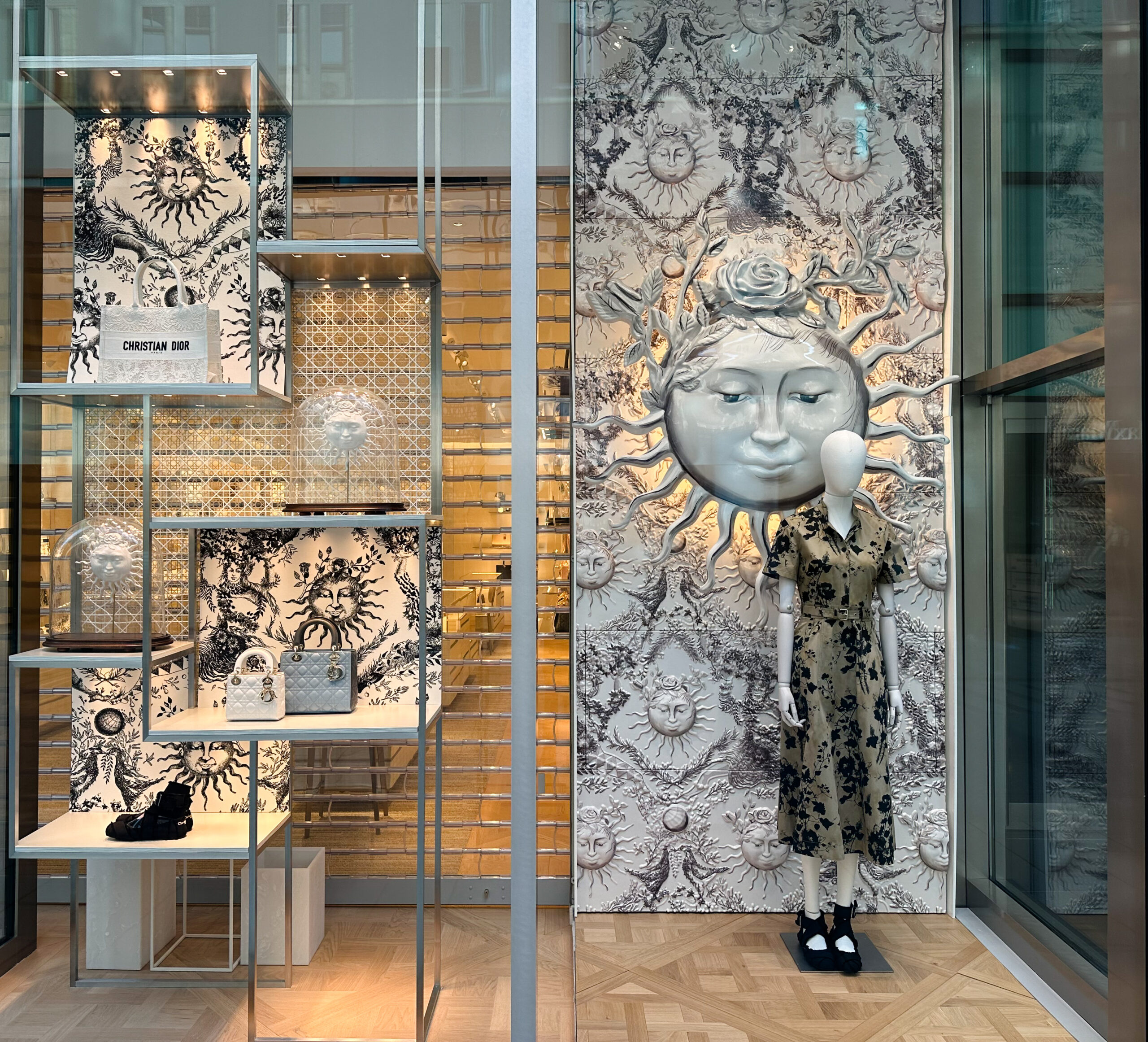
The color effect has a big impact on retail displays. It can change how stores look and how people shop. Using color wisely in visual merchandising can boost sales and make shopping fun. We’ll look into how color psychology works and how it’s used in eye-catching displays.
We aim to share useful tips and strategies for using the color effect in visual merchandising. We’ll also talk about how to make retail displays that grab people’s attention. The right use of color can really change how customers act and can help sell more.
We’ll explore the role of color in retail displays. We’ll give you a full guide on how to use the color effect for engaging visual merchandising. By the end, you’ll know more about the color effect and how to use it to increase sales and make shopping memorable.
Understanding the Science Behind Color Psychology in Retail
Exploring color in visual merchandising leads us to the science of color psychology. It shows how colors affect consumer behavior. For example, red is linked to energy, while blue is about trust.
Color greatly influences how people see and feel about brands. A study by the Pantone Color Institute found 62% of shoppers choose based on color. This shows how cultural color preferences matter in retail.
Knowing how colors affect consumer behavior helps retailers target their audience. Nike uses bold colors to appeal to young athletes. Gucci, on the other hand, uses calm colors to show luxury.
The Psychological Impact of Different Colors
Colors can be warm or cool, each with its own emotional effect. Warm colors like orange and yellow make us excited. Cool colors like green and blue calm us down.
The Color Effect in Visual Merchandising Design
Color plays a big role in making a store feel welcoming. By using color wisely, stores can draw attention and highlight products. Color blocking helps organize spaces, making them look good and work well together.
Color consistency is key for a strong brand image. Stores like Apple and Nike use color blocking to look the same everywhere. This makes their brand easy to spot and remember.
The table below shows how color affects shoppers and stores:
| Color | Emotion Evoked | Retail Application |
|---|---|---|
| Red | Energy, excitement | Point-of-purchase displays, sales promotions |
| Blue | Trust, calmness | Brand logos, loyalty programs |
| Green | Nature, harmony | Eco-friendly product displays, outdoor sections |
Knowing how color affects people helps stores create a better shopping experience. Using color smartly can boost sales and make the brand stand out. It makes shopping more fun and memorable for everyone.
Creating Effective Color Schemes for Retail Displays
Color schemes are key in retail displays to grab customers’ attention and boost sales. Understanding color theory is crucial for effective designs. Using seasonal colors and matching colors can make displays appealing to the target audience.
A good color scheme can greatly improve the shopping experience. Warm colors like orange and yellow make spaces feel cozy. Cool colors, such as blue and green, bring calmness. Knowing how colors affect us helps retailers match their brand and appeal to their audience.
Adding seasonal colors to displays can make them timely and urgent. For example, pastel colors in spring or bold colors in summer add festivity. This keeps displays fresh and competitive.
| Season | Color Scheme | Emotional Impact |
|---|---|---|
| Spring | Pastel colors | Hope, renewal, and freshness |
| Summer | Bold colors | Energy, excitement, and warmth |
| Autumn | Earth tones | Coziness, comfort, and nostalgia |
| Winter | Cool colors | Calmness, serenity, and sophistication |
By applying these principles, retailers can create color schemes that boost sales and enhance the shopping experience. This sets their brand apart from others.
Strategic Color Placement in Store Layouts
We know that color placement is key in setting up a store layout. It guides how customers move around. By using color smartly, stores can show off special deals and organize different areas.
A good store layout uses color placement to make shopping fun. For example, contrasting colors can grab attention. A consistent color scheme keeps the store feeling connected. This way, stores can make customers want to see more.
Looking at successful color placement in different stores can teach a lot. Retailers can learn how to use color placement in their store layout. This can make shopping better and keep customers interested.
Lighting and Its Impact on Color Perception
Retail lighting is key in creating an immersive shopping experience. The lighting can make colors seem more vibrant or dull. This changes the store’s atmosphere and how customers feel.
The lighting type greatly affects color perception. Natural light shows true colors, while artificial light can distort them. Retailers can use this knowledge to make their products look better.
The color temperature of the lighting also matters. Warm lighting feels cozy, while cool lighting looks modern. By choosing the right lighting, stores can create a unique atmosphere. This draws in customers and keeps them coming back.
Digital Integration with Physical Color Displays
The retail world is changing fast, with digital integration playing a big role. As people move between online and offline, keeping colors consistent is key. This is where digital and physical color displays meet, linking the two worlds together.
Adding digital elements, like digital signage, to physical displays can improve the shopping experience. Color consistency is vital for a unified brand image. Digital tools help match colors across all platforms. For example, digital signage can show products in various colors, helping customers see how they look in real life.
Online to Offline Color Consistency
Keeping colors the same online and offline is crucial for a strong brand. Retailers use digital tools to match online and in-store colors. This makes the brand more recognizable and engaging for customers.
Digital Signage Color Optimization
Digital signage grabs attention and shares information in stores. By choosing the right colors, retailers can make displays stand out. For instance, bright colors can highlight deals, while softer colors can create a calm atmosphere.
| Color | Emotion | Usage |
|---|---|---|
| Red | Energy, excitement | Promotions, sales |
| Blue | Calmness, trust | Brand identity, loyalty programs |
| Green | Nature, growth | Eco-friendly products, outdoor gear |
By using digital integration and smart color choices in digital signage, retailers can make shopping more fun and engaging. This approach boosts sales and loyalty.
Measuring the Success of Color Strategies
We use color strategy ROI to check how well our visual merchandising works. By looking at visual merchandising metrics like sales and customer interaction, we see how colors affect our business.
To make our color strategies better, we test them in stores. We try out different colors and see how they change customer behavior and sales. We also use tools like heat mapping and eye-tracking to see how colors affect people in the store.
By studying our color testing and visual merchandising metrics, we find ways to get better. This helps us make our visual displays more effective. They help sell more and make customers happier.
Common Color Mistakes to Avoid in Visual Merchandising
Many retailers make color mistakes that harm their visual merchandising. These errors confuse customers and lower sales. One big mistake is using too many colors, which can confuse and weaken the display’s impact.
Another error is not considering the target audience when choosing colors. This can lead to color palette issues that don’t connect with the audience. For instance, young adults might like bright, bold colors, while older adults prefer softer, neutral ones.
To avoid these mistakes, retailers should think about their audience and pick colors they’ll like. They should aim for a balanced color scheme that’s easy to look at and highlights important products. By avoiding common color mistakes and planning a good color strategy, retailers can boost their visual merchandising and sales.
| Color Mistake | Effect on Visual Merchandising |
|---|---|
| Overcrowding the color palette | Visual confusion and reduced impact |
| Ignoring target demographics | Failure to resonate with the intended audience |
| Poor contrast decisions | Hindered readability and product visibility |
By knowing these common color mistakes and avoiding them, retailers can make engaging visual merchandising displays. These displays can attract customers and increase sales.
Conclusion: Maximizing the Power of Color in Retail Displays
Color is a key tool in creating engaging retail experiences. By understanding color psychology, retailers can use color strategies effectively. This helps them stay on top of visual merchandising trends in retail display optimization.
We’ve looked at how to pick the right colors and arrange them in stores. We’ve also talked about matching colors in both physical and digital spaces. These skills help retailers use color to connect with customers, strengthen their brand, and boost sales.
As retail changes, color should be seen as a flexible tool in visual merchandising. Try out new color schemes and materials to make your store stand out. Keep improving your color strategy based on what customers say and how well it works. This way, you can make the most of color in your displays and succeed in the long run.

